Standardisation of reading charts
Reading acuity is a skill relevant for daily life. It is measured with the help of near reading charts. Staff members of the Institute of Ophthalmology at the University Hospital of St. Pölten, a KL's teaching and research location, have dealt with different aspects of standardising near reading charts.
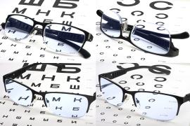
Reading charts are an established instrument for the assessment of functional near vision. Due to their increasing use, the International Organisation for Standards (ISO) is interested in a standard for reading panels. Currently, there are two options for calibrating near reading charts: either x-height, which is the size of the small "x" as proposed by the International Ophthalmic Panel, or the use of Landolt rings. Landolt rings are standardised signs in ophthalmology for determining visual acuity, also called optotypes. Near reading charts are used at 40 centimetres.
Font selection for near reading chartsDr. Barbara Daxer from the Karl Landsteiner University and other researchers investigated the influence of different font types on legibility. In detail, the ophthalmologists examined whether a font with or without serifs could be read better by the test persons. Serifs are the short strokes across the basic direction of a font. The two fonts used on the near reading charts, Helvetica and Times New Roman, were specially calibrated to exclude bias due to differences in size and spacing. The sample texts were designed to be comparable in terms of length, syntax, and number of words. The reading speed, number of reading errors and reading time of 36 persons with normal visual acuity served as parameters of legibility. Parameters were comparable in Helvetica and Times Roman font and therefore both fonts can be classified as equivalent for the use of a standard.
Print quality of near reading chartsTo find out whether near vision tests that use Landolt rings can be calibrated, they were subjected to a microscopic quality test. Different Landolt ring test charts for near vision were assessed for the thickness of the lines, the width of the apertures and the height of the imprinted Landolt rings. The deviations found from the specified EN/ISO 8596 standard on Landolt rings were greater than permissible. Since due to the mechanics of printing certain quality losses cannot be avoided, the researchers conclude that the use of Landolt rings as a calibration method for near vision charts is not recommended but the use of x-height is to be preferred.
Results freely availableBoth publications of the Department of Ophthalmology of the University Hospital St Pölten are freely available and provide valuable insights for the standardisation process of near reading charts for testing functional near vision.
Original publications

